The information within advanced reports is influenced by permissions and the company's hierarchy. This means that even though you might have access to advanced reports, the information you see, such as salaries, will be tailored to your hierarchical position within the company. For instance, the average salary you see could differ significantly from what your manager sees, reflecting the varying hierarchical levels.
What is a Custom Widget in Factorial?
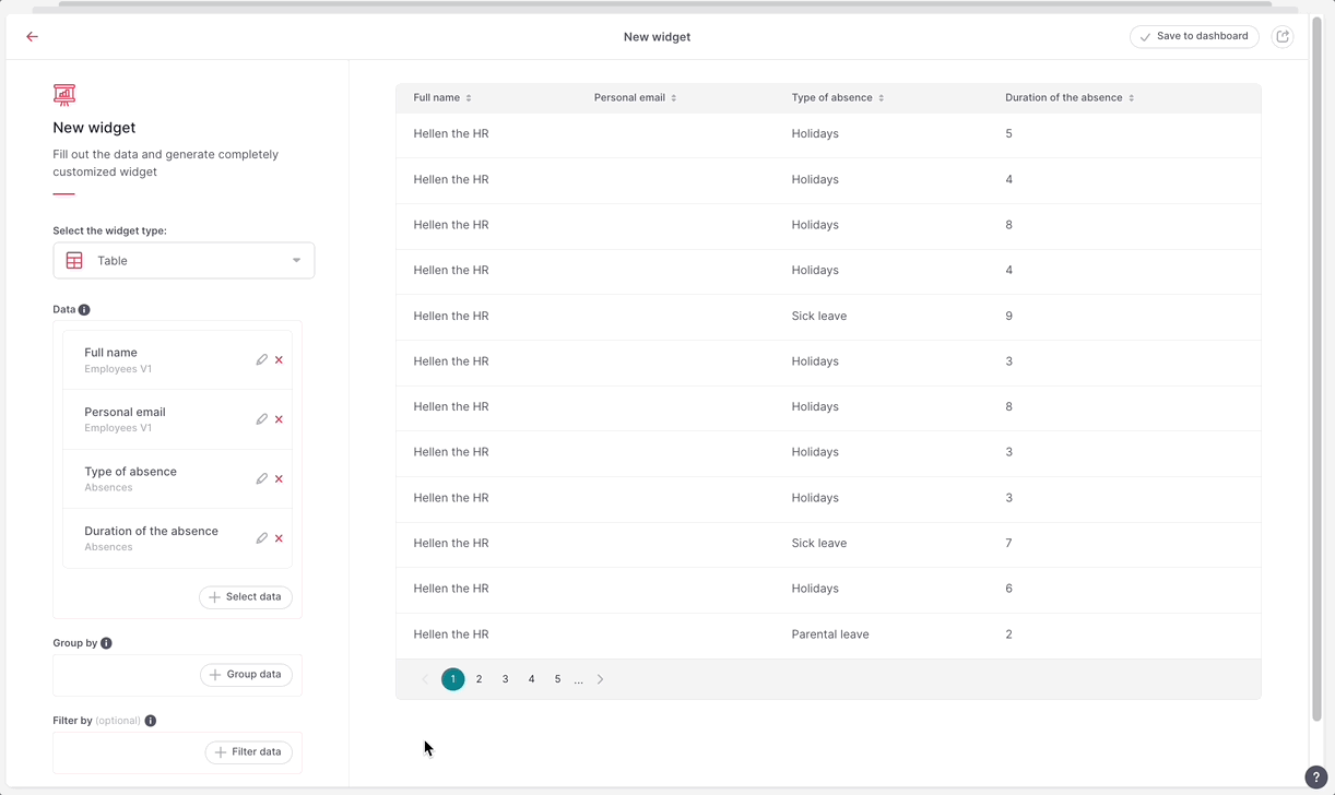
A custom widget is a personalized data visualization element that you can create and add to your dashboard. These widgets allow you to display specific HR metrics and KPIs tailored to your company's needs, providing insights into areas like performance, training, hiring, diversity, leave management, and retention.
The custom widget builder is only available on Enterprise plans.
Where to find the widget builder
- On your sidebar, go to Analytics
- Head to Advanced reports
- Open a dashboard or create a new one
- Click on Add new widget and select Use widget builder

How to create a widget
- From the Widget builder page, select the widget type:
- Bar chart
- Pie chart
- Lines chart
- Area chart
- Table
- Summary
- Select the data you want to see. You have the ability to:
- Group your information based on any data
- Filter the data to include or exclude specific information
If you encounter duplicated information in the table chart (e.g., you see the same employee in multiple rows), simply group the data by the relevant field. In this case, group by Employee full name.
When creating widgets with Bar, Line, or Area chart types, you can visualize cohort type of information. To create cohort widgets, ensure that you've chosen cohort data for the X-axis. You can identify cohort data by the 'clock icon' next to the field.
Also, remember that when you want to create a bar, line, or area chart, you should always have a numerical value for the Y-axis. You can either select a numeric field or, if you choose another field, aggregate it by count.
3. When you are done, click on Save to dashboard

If you select any field, the builder will guide you which fields are compatible along with the ones you’ve already selected by graying out the none compatible ones.
If you change the order of data in the left selection list (e.g., from 'name, surname, gender' to 'gender, name, surname'), it can cause errors in some cases because the selection order is crucial technically. If you encounter an error while changing the order, you should revert to the original order.
The widget builder doesn’t allow to select data from more than 2 tables for now. You can always do that with SQL editor.
How to edit a widget
- From the Dashboard page, choose the widget you want to edit
- Click on the three dots icon
- Select View and edit
- Make the changes
- Click on Save to dashboard
- Edit the widget name
- Click on Save widget

You can edit and customize a widget using the SQL editor.
- From the Dashboard page, choose the widget you want to edit
- Click on the three dots icon
- Select Open in SQL editor
By clicking on the three dots icon, you can also:
- Share the widget
- Clone the widget
- Move it to another dashboard
- Download it (.cvs, .xlsx or .txt)
- Remove it
Custom widget’s sections breakdown and types
When building a custom widget, it’s important to understand the different sections available. Each section plays a specific role in defining what data is shown, how it’s filtered, and how it’s grouped or organized.
Section types
- Data (What to display). Select the information you want to show in the widget, such as employee name, email, or contract type. These fields are the visible data columns in your report.
-
Filters (What conditions apply). Filters let you narrow the data shown in the widget based on specific conditions. For example:
- Show only active employees (
Employee status = Active) - Display people without a personal email (
Personal email is not defined) - Combine multiple conditions using OR logic (
Status = Active OR Inactive)
- Show only active employees (
-
Group By (How to organize results). This section helps you group repeated information. For instance:
- Count total holidays per employee
- Group different absence types by person
- Aggregate multiple entries using functions like Sum or Comma-separated
Grouping helps simplify and organize complex data into meaningful insights.
Chart Examples
- Line and Area Charts: Show evolution over time—e.g., monthly employee counts appear identically in either chart style.
- Pie Chart: Good for team distribution—displays total headcount per team and can incorporate filters like only active employees.
- Bar Chart: Works like line charts but uses bars; great for comparing metrics such as employee count over time or across categories.